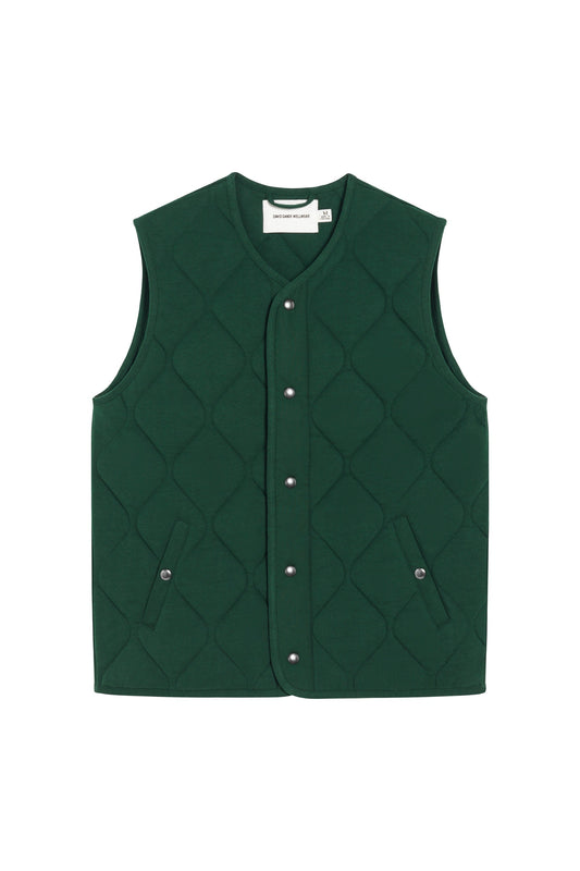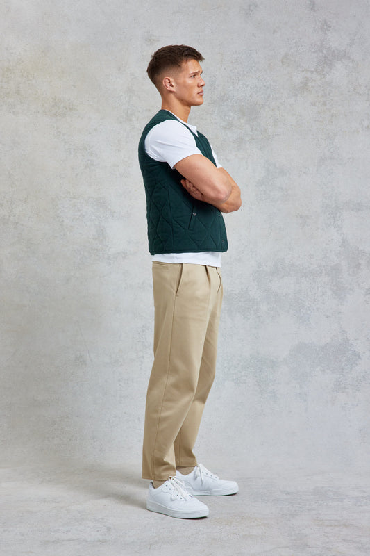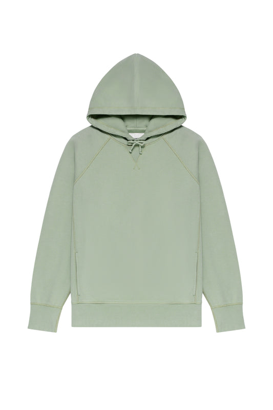


As signature Wellwear styles are introduced in a new green, colour expert Kassia St Clair explains the power of the palette
Whether we want to acknowledge it or not, colour has an immense impact on all of us. Consider how certain colours have strong cultural resonance: purple signals royalty; red power, and so on.
There were actually laws—called sumptuary laws — in many parts of Medieval Europe to codify which people could wear which colours. Russets and earthy browns were usually for the lower strata of society, like those who worked on the land. Brights were for the rich and powerful. This was a way of trying to order society visually. Although, given how often these laws were passed and re-passed, it’s likely that people were constantly breaking them.
We tend to think of black as a modern 20th- and 21st-century colour of the fashionable – all those fashion editors in monochrome front rows – but it has been fashionable for a long time. Famously, the Regency dandy Beau Brummell believed true taste to be more about cut than colour, which he regarded more as a distraction. This set him and his set apart, since the court at the time was better known for its vibrant, spangled textiles.
Earlier still, in Medieval Europe, black was also sometimes a sign of distinction because it was difficult to create a beautiful, even black dye for cloth. It was usually made by mixing or layering different colours, which often led to mottled or uneven results that were prone to fading or changing colour over time. It took immense skill to produce a whole bolt of lustrous black, and dyers could charge accordingly. So those who wore it were showing discernment and wealth. Black was also rarely restricted by sumptuary laws, so fine black cloth was favoured by those who acquired their wealth through trade, rather than by being born into the nobility.
It was also – because it wasn’t as associated with the nobility – believed to signify simplicity and strict morals. Those who wore it could claim some kind of moral authority while also displaying their success. A way of having their sartorial cake and eating it.
But while some of the associations we have with the colour black have been relatively stable, other colours have enjoyed more varied fortunes. Take pink, for example, Today, the accepted notion is that blue is for boys and pink for girls. But a century ago it was the other way round. A famous article in the New York Times of 1918 suggested those buying baby clothes select pink for boys because it was aligned with red, the martial colour of uniforms and a more “decided” shade.
Some hues have also been subject to wild swings in popularity: the height of fashion one year and thoroughly passé the next. A few years ago, everyone was talking about Millennial pink and Gen Z yellow. The 1970s were all about avocado and harvest gold, when, after space exploration and some prominent environmental disasters, there was a burst of concern about the fragility of the natural world. This fed into popular culture, boosting a desire for natural materials and colours associated with nature.
We can also see how big cultural events can shift colour trends. Around 2012, there was a flood of super brights, particularly in footwear. This likely had something to do with the Olympics, since prominent sportswear brands wanted their athletes to stand out on HD TVs and so used neons in their designs. That was followed by a more muted period of normcore. Colour trends often work in cycles: it’s interesting that in the wake of the pandemic, lots of people seem to be gravitating to colours like orange and yellow that are seen as cheerful and reviving.
There is something else to look out for in the future comes from the digital world. As we live more and more online, and the idea of avatars gains momentum, designers are experimenting with clothing them in “colours” rendered digitally that do not – and sometimes even could not – exist in the fashions of the material world. For example, a very soft cloth with a perfect mirrored finish doesn’t exist. But there’s no reason it can’t digitally.
But while digitally driven trends such as this are exciting, there is undoubtedly a counter-reaction. If our fast-paced world is pushing us one way, we have a parallel desire to connect with the natural world.
Enter the rise of green. And though this hue has many meanings globally, its essential association is with the earth, the trees, the grasses and plants that surround us.
This means green is usually interpreted as a calming, grounding and centring colour. It is also political in a generally positive way: think green policies. As in the 1970s, there is a growing awareness that nature is precious, but today this is given more urgency because of our greater understanding of climate change. If green is precious, it is also soothing. Think about the fashion in interior design and architecture for house plants and more ambitious and large-scale planting in buildings, bringing the outside in. There is evidence that it is good for us to be surrounded by greenery: the Japanese have started encouraging “forest bathing” to help people relieve stress and tension.
When it comes to green in clothing, that reassuring connection with the natural world remains. And, since we wear clothes that tell the world something about how we want to be perceived, wearing green can also subconsciously suggests that the natural world matters to you.
Interestingly, a few years back, just before Covid-19 hit, there was a neo-mint hue being touted by the fashion world, a pale aqua colour. This was spoken of as a hue that brought the worlds of nature and technology together. The pandemic rather overshadowed this development, and now as we emerge from it, it seems we want a green that is wholly natural, an antidote to technology.
David Gandy Wellwear’s collection of green-coloured pieces was inspired by a study that asked people to exercise indoors while watching a film showing outdoor space with a green overlay, and then also doing the same with the film overlaid with red or grey. When exposed to the green film, the subjects perceived less exertion and experienced less mood disturbance.
Of course, there are other colours that can contribute to our well-being. Blue is also reassuring. Think of how many companies that want you to trust them use blue in their logos – banks, the NHS and, more recently, tech firms. The latter, after all, are handling our personal data, our family photos and our bank details: they need us to perceive them as trustworthy.
Blue is also a beloved colour. Since WWII, blue has been the global favourite colour for both men and women. However, there are signs that blue may have competition. One survey a few years ago showed a shift towards green. It’s possible this may have something to do with the rising awareness of green issues and the threat of climate change. But it could also be because blue is losing some of that trustworthy cultural resonance through overuse and some more negative associations.
It is lucky for us, now that green is becoming more popular, that we have the wherewithal to make it. Before the 19th century, green colourants were very tricky and quite rare: a surprise given how much green there is in nature. Greens were usually produced by mixing blues and yellows, which often resulted in a patchy or dull end-product if not done by a master dyer. In the famous 1434 Jan van Eyck painting The Arnolfini Portrait, the fact that the woman is wearing a sumptuous green dress speaks of the wealth of this couple; it is believed that the picture is of Giovanni di Nicolao Arnolfini – an Italian cloth merchant – and his wife.
Finally, if you want evidence of the seductive power of the colour green, consider this. When Scheele’s green was invented in the late 18th century, it became incredibly popular very quickly, only for people to discover it was filled with poisonous arsenic. However, even once people were made aware of the danger, they were reluctant to give up on it, so entranced were they by the colour.
Kassia St Clair is a cultural historian and colour expert, and the author of The Secret Lives of Colour and The Golden Thread.